The next step in learning how to take great pictures of your kids involves delving into one of the true black arts of photography, composition. While standard rules of composition can be thrown out at any moment to achieve the right affect, the following are just some good rules of thumb that not only apply to photographing children, but to full-sized persons as well.
Sink to Their Level
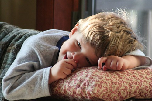
First and foremost, if you still have pint-sized tikes you’re going to have to bend those knees, get down on your belly, and be ready to get up close and personal with the reality of when you last vacuumed your carpets. Getting down low on your child’s level is the best thing you can do to separate your shots from run-of-the-mill candids. Seeing things from a different perspective will get your creative juices flowing while also providing some great new angles to shoot from.
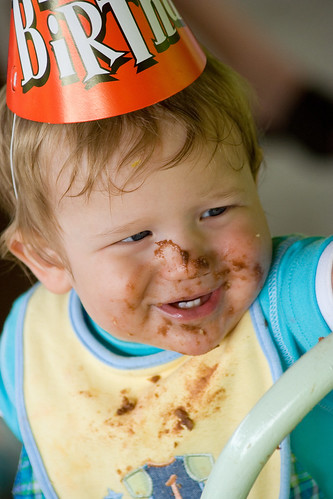
A fresh look will help better capture those one-in-a-million facial expressions of kids that go along having a loose grasp of social propriety. There’s nothing worse than top-down shots of glassy-eyed toddlers straining their necks upwards to see what you’re doing 5 feet above them.
Fill the Frame
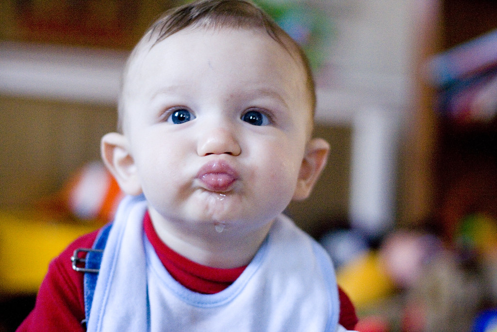
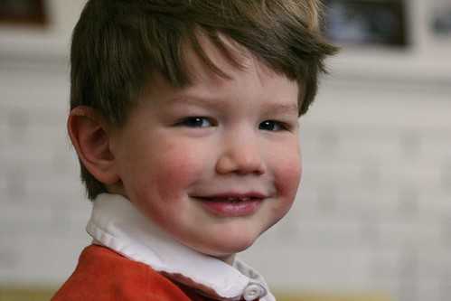
If you want to document your trendy Pottery Barn bought furniture for posterity’s sake, go ahead and do that. But when you’re shooting your kids, there’s no reason your end-table should take up two thirds of your total picture. Fill your viewfinder with your child, and just when you think you can’t get any closer, see if you can push in again. I treasure the photos of my youngest that showcase his near blonde curls he had between the age of one and two and I’m absolutely enamored by both of my boys’ blue eyes (My wife and I have brown and hazel peepers respectively so it’s a statistically improbable feat!) Those are the kinds of details you’re going to want to remember 20 years from now (the smiles, the funny faces, their eye color) not that throw pillow you bought at Bed Bath & Beyond.
Put them, as my grandmother used to say, “Catty-Whompus”
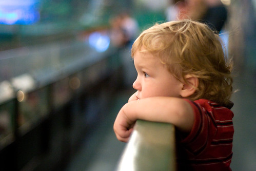
This is one of those touchy-feely, fuzzy logic rules. You’ll read photography book after photography book that tells you not to place your subject in the absolute middle of the frame. They’ll talk about the golden ratio, the way the eye moves across a page, blah blah blah blah. I don’t necessarily know about any of that, but let me put it this way; generally, shots look better when you follow that advice. It’s not something I can put my finger on, but a slightly off-center composition has that extra “something” that a dead center portrait does not. Hey, if you were looking for hard facts and justifications you’re barking up the wrong tree. I warned you this one was fuzzy logic.
Off with their heads!
Let’s face it, sometimes fitting the best composition into a 6×4 box can be somewhat limiting. To showcase that great gap in a smile where a first lost tooth used to be, you have to get in really close. Cutting off the top of the head in your viewfinder used to be a no-no but is more and more accepted as a solid composition choice. You’ll even see it in a lot of commercial photography. Just flip through a magazine and look at the ads featuring people. You’ll see chopped heads more often than you would think. Remember, the top of the head is fair game, but you can’t crop in from below past the chin. That just doesn’t look right.
Keep an eye on the background
There’s nothing worse than reviewing a batch of photos in which you think you’ve taken a real keeper of your kid only to find out there was a lamp growing out of the top of their head, or worse yet, your ugly mug is reflected in your equally unattractive commemorative Asia Reunion Tour mirror. Even if you plan on blurring out your background with shallow depth of field, be mindful of the other elements in your viewfinder as they can sometimes make or break a classic shot. It’s pretty common to overlook something in the corners of your frame when your focus is so intent on your subject. I’ve taken to literally looking into each of the four corners of my viewfinder before taking a picture just to make sure I’m not missing anything.
Look for the light
This is a bit of cheat because lighting isn’t a composition tip per se, but I couldn’t logically fit it into parts I, III, or IV so… there you have it. Most photographers will swear by natural window light for all portraits, but for children I would argue this is doubly true. In a way, it’s easier to light children with natural light because in theory they have fewer flaws to hide (wrinkles, laugh lines, unsightly tattoos declaring your unyielding devotion to a 80’s hair metal band). Plopping really young kids down on a window seat is a perfect way to harness a great, free, lighting resource for memorable portraits. So the moral of the story is always look for good natural light and NEVER EVER use your pop up flash if you can help it. Unless of course you prefer shots of your children that make them look like extras in a George Romero movie.
- Coming up next: Getting those wacky kids to cooperate
- Part 1: The 50mm lens





Leave a reply